Tuesday, June 21, 2011
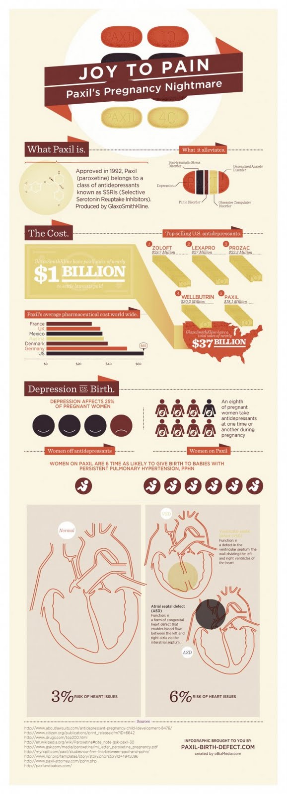
Paxil Infographic
I used this infographic in another exercise, so I am going to try to examine it deeper in this blog. One thing that jumps out at me is the small font size. There are sections where the font is so small that it is hard to read. Also there are many different font types in this graphic. It seems like they took five different presentations and combined them into one big infographic. Another thing that stands out is the bar graph labeled Paxil's average pharmacy cost. The choice of color for Austria is poor, it is hard to see on the light background. The next thing I noticed is the graphic of the Paxil tablet and how it is broken up into slices. This is confusing because I am not sure if this is suppose to be a pie chart and if it is, it would be better of to show the data as a pie chart.
Thursday, June 16, 2011
Saturday, June 11, 2011
Elevator Pitch First Attempt
I post this video here because I was not sure where we were suppose to post. This is presentation 3 Elevator Pitch
Subscribe to:
Comments (Atom)


