I chose this slide that I got from GE and I like their slides because they use clean white
backgrounds, a nice sans sarif font, the pictures are high quality, and the diagrams are always well drawn. I think they must have someone or a group of people that are in charge of creating their power points. I noticed Reynolds used a presentation from GE as an example in his book. I found the slides I have are very similar to the ones featured in the book.
Thursday, July 14, 2011
Sunday, July 10, 2011
Evaluating my Powerpoints
In this entry I decided to go back and look at some of the Power Points I use in my classes that I teach. The first one I looked at was one that came out of the Prenhall text book. I run these in slideshow view with animations. The first screen is the slide before the animation. The second is after the animation runs. The first thing I picked out was the word voltage in the blue box is a bit hard to see and I think it would be better with a white font color. Also, the chapter 2 box and summary box could be taken out, because they don't add anything to the slide.
Bad Color Wheel
I picked this image as an example of color that does not consider people with color deficiencies and is much different than the color wheel posted earlier. Nothing is labeled, so it is hard for me to pick a color. This image is from Microsoft Word and I was trying to make a chart using either Monochromatic or Analogous colors, but it was hard to figure out the colors, so the only color scheme I could use is Complementary. One thing I did notice was the darker shades are placed on the outside to help the colors pop out.
Tuesday, June 21, 2011
Color Wheel
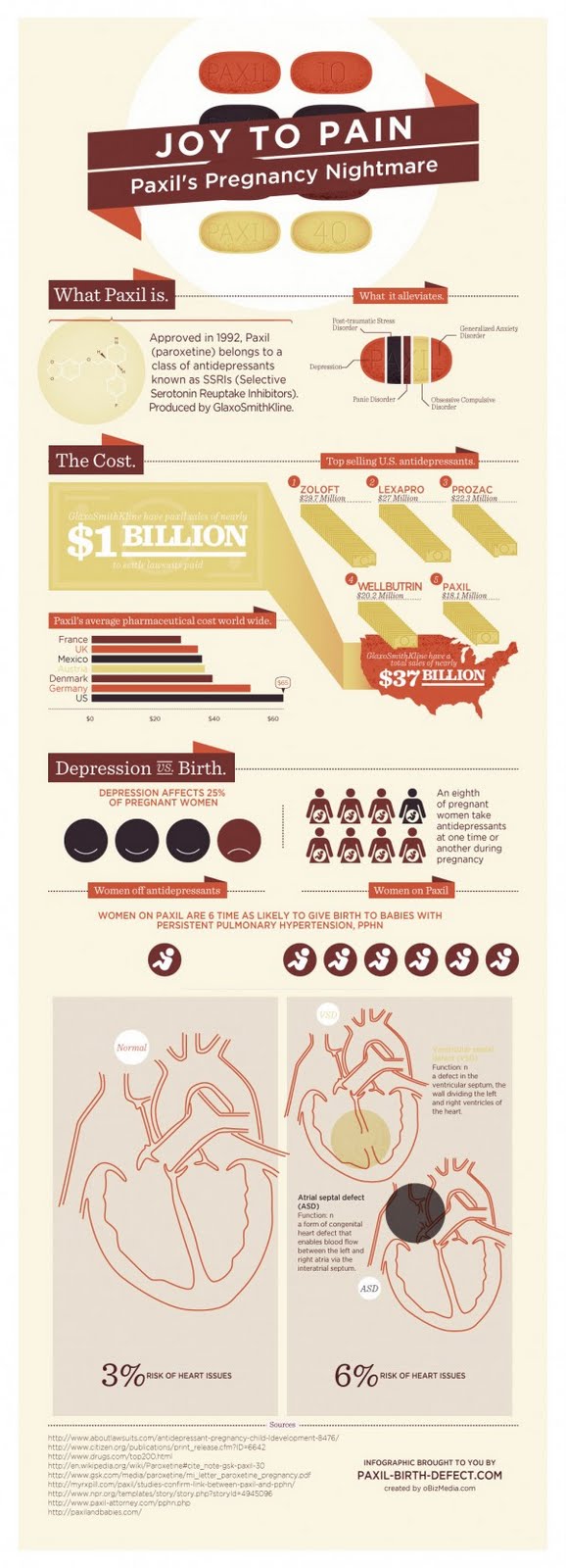
Paxil Infographic
I used this infographic in another exercise, so I am going to try to examine it deeper in this blog. One thing that jumps out at me is the small font size. There are sections where the font is so small that it is hard to read. Also there are many different font types in this graphic. It seems like they took five different presentations and combined them into one big infographic. Another thing that stands out is the bar graph labeled Paxil's average pharmacy cost. The choice of color for Austria is poor, it is hard to see on the light background. The next thing I noticed is the graphic of the Paxil tablet and how it is broken up into slices. This is confusing because I am not sure if this is suppose to be a pie chart and if it is, it would be better of to show the data as a pie chart.
Thursday, June 16, 2011
Saturday, June 11, 2011
Elevator Pitch First Attempt
I post this video here because I was not sure where we were suppose to post. This is presentation 3 Elevator Pitch
Subscribe to:
Comments (Atom)


